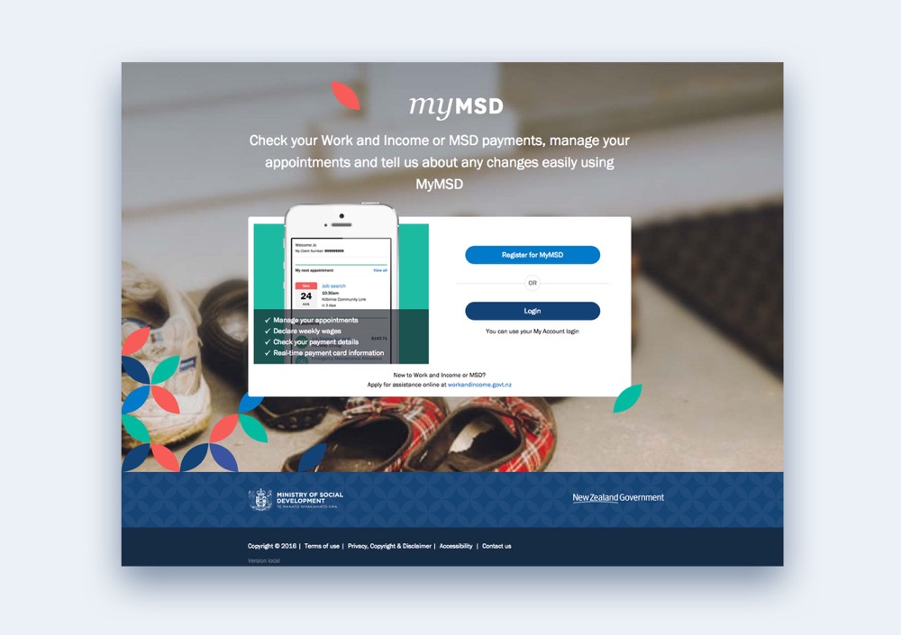
myMSD: redefining self-service
I love what simple service design can do when it's paired with an elegant online solution, especially on self-service portals. That made the redesign of the Ministry of Social Development's StudyLink and myMSD portals an especially exciting brief to take on.
The challenge went beyond building something usable. It was also about shifting how the public felt about these organisations. Once the redesigned portals launched, people moved away from WINZ's existing, not very user-friendly system in large numbers.
- Client
- Ministry of Social Development
- Role
- Digital Strategy
UX Design
Creative Direction - Recognition
- Finalist at Best Design Awards
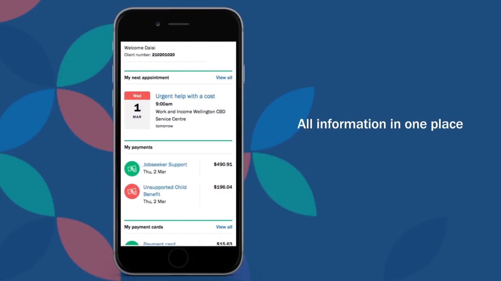 Play video: Ministry of Social Development case study
The portal
Built for stressful moments: 2 million New Zealanders rely on these services, often from a phone, often under pressure.
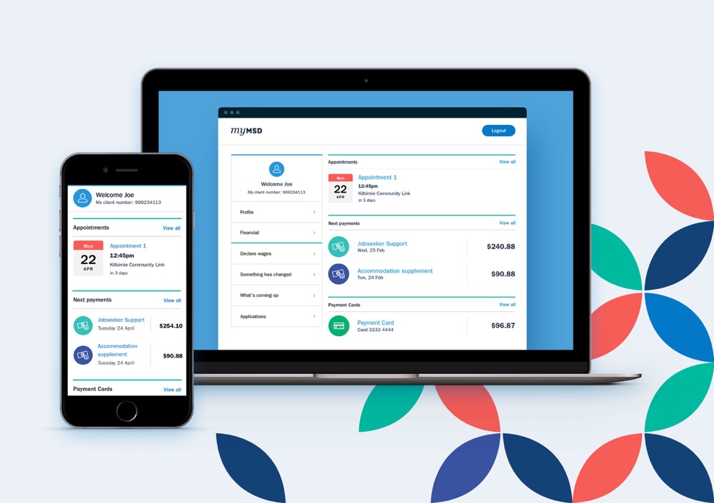
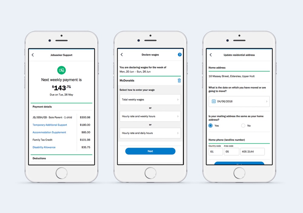
Through myMSD and StudyLink, people track social security and pension payments, book appointments with counsellors, manage student loans and applications, and apply for social assistance. A lot of that happens on mobile, and rarely in a calm moment.
The design needed to respect that. It had to put people at ease and make their interactions with the “faceless bureaucracy” of MSD brief, efficient, approachable and helpful, rather than one more hurdle to get through.
How we worked
Dual-track Agile: discovery ran a track ahead of delivery, and checked back in on it every other sprint
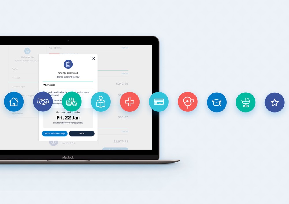
This was a large project delivered in a genuinely agile way. It started with user journeys for each persona, which the project team used to define MVP targets for each release.
From there, we split delivery into two tracks. Discovery ran ahead, where my team led co-design workshops, developed concepts, and turned them into specifications for the development track behind it. Every other sprint, we paused to look back at what had shipped and test it with real users, to make sure we were still on track.
Outcome
People chose it over WINZ: for the first time in the Ministry’s digital history, the feedback was positive
For the first time in the Ministry's digital history, the feedback was positive. Staying close to user journeys and testing every other sprint meant the delivered product stayed aligned to what people actually needed, built around simplicity and efficiency rather than process.
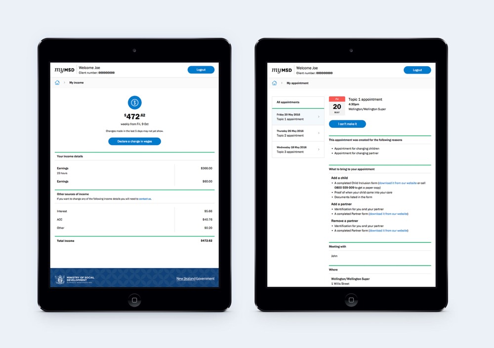
Features like PIN login and user dashboards extended the self-service menu, and adoption followed: people moved away from the existing WINZ service in droves, ahead of the targets we'd set.
Design deep dive
Key design decisions
- Co-design with real users
- We ran co-design workshops with the people who actually use these services, not just MSD staff. Their input shaped the information architecture, language, and flow of every core task in the portal.
- Focused on providing full self-service
- Features like PIN login and user dashboards expanded what people could do themselves — reducing reliance on phone calls and in-person visits, and putting more control in the hands of users.
- PIN login
- A simple, fast authentication flow that reduced friction for returning users — critical when people are accessing services under stress and don't have time to recover forgotten passwords.
- User dashboards
- Personalised dashboards surfacing what matters most to each person — upcoming payments, appointments, outstanding tasks — so users could see their situation at a glance without digging through menus.